What 200% YoY GMV growth actually is. A walkthrough of a marketplace dashboard on the Olist dataset — and what shows up when you look past the headline numbers.
Source code and data prep Dashboard link
Why Olist?
Olist is an open dataset on Kaggle — Brazilian marketplace data, free to use. Orders, customers, sellers. Payments, reviews, delivery. Many categories, strong seasonality, plenty of noise. Messy enough to be realistic; structured enough to use without weeks of cleanup.
What the dashboard shows
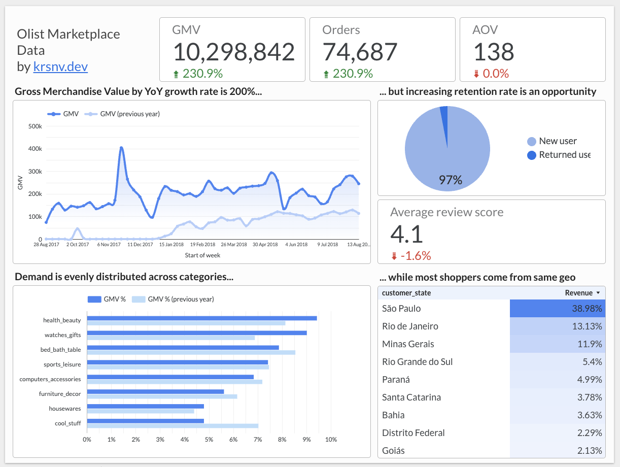
Growth. GMV 10,298,842 · Orders 74,687 · AOV 138 · YoY GMV +230.9% · YoY Orders +230.9% · AOV change 0.0%. GMV and orders grow at the same rate, AOV is flat — so growth is more transactions, not bigger baskets. That’s the constraint for scaling. Weekly GMV: higher baseline than last year, sharp peaks (campaigns or seasonality), quick recoveries after dips. Not a smooth line, more like controlled chaos.
Retention and quality. 97% new users, 3% returning. Acquisition-led growth, not retention; if acquisition slows or gets costlier, GMV follows. Fixing retention will likely beat most acquisition experiments. Average review score 4.1, –1.6% YoY. A small drop, but at scale slipping scores often show up before revenue: worse conversion, fewer repeats, more spend on marketing. Easy to ignore, costly to fix later.
Structure. GMV is spread across health_beauty, watches_gifts, bed_bath_table, sports_leisure, computers_accessories — no category dominates. Geography: São Paulo ~39%, Rio ~13%, Minas Gerais ~12%. Two options: improve logistics and delivery in these regions, or expand where demand exists but penetration is low.
Looker Studio and bottom line
I used this project to test Looker Studio properly. It’s flexible — you can build almost anything — but you also decide layout, logic, and visuals yourself; it doesn’t enforce defaults or make charts look good for you. You pay for that flexibility with time and attention. A more opinionated tool would leave more room for insights and less for configuration.
This dashboard isn’t polished, isn’t a pitch deck, isn’t finished. It does: surface real trade-offs, create a fast loop for better questions, remind you that growth metrics hide as much as they show. Missing for now: cohort analysis, LTV and repeat-purchase modeling, seller-level performance. 200% YoY looks great on its own; a dashboard’s job is to break that illusion. Underneath: growth is all acquisition, retention is weak, quality is slipping. Analytics isn’t for celebrating numbers — it’s for spotting problems while they’re still cheap to fix.